How to Make a Waterfall Chart
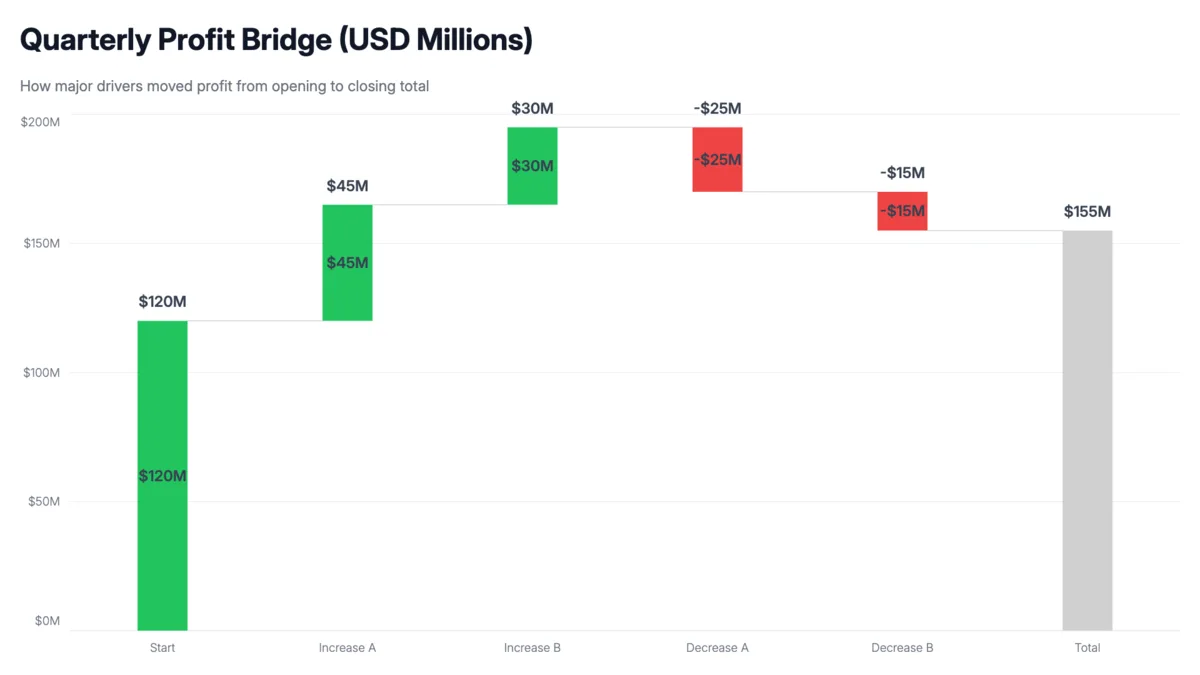
A waterfall chart shows how a starting value builds up or breaks down into a final total through a series of positive and negative changes. Finance and strategy teams use them for P&L statements, revenue bridges, budget variance, and anything that needs to answer "how did we get from A to B." Here's how to make one in minutes.
Steps
Prepare your data
Set up two columns: one for labels, one for values. Increases are positive numbers, decreases are negative. The final row is your total — enter its actual value, not a delta. AECharts uses it as the sum bar and anchors it to the baseline automatically.
| Category | Value |
|---|---|
| Last Year Revenue | 4,800,000 |
| New Customers | 620,000 |
| Expansion | 180,000 |
| Price Increases | 250,000 |
| Churn | -150,000 |
| This Year Revenue | 5,700,000 |
Add your data
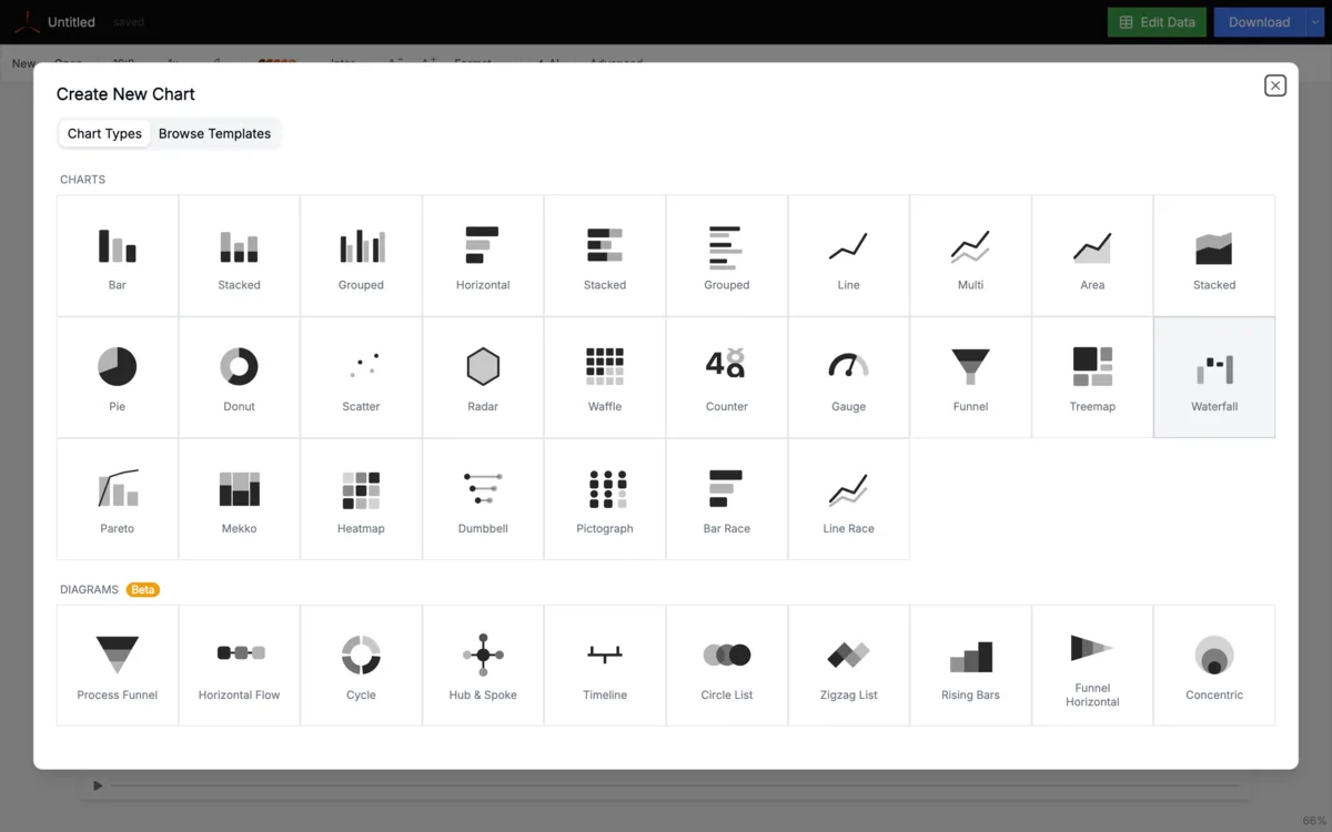
Click the Edit Data button on the top right to open the spreadsheet. Paste your data directly, or click Upload Data to import a CSV or Excel file. AECharts reads your two columns and builds the floating bars automatically — positive values rise, negative values hang down from where the previous bar ended.
Set bar colors
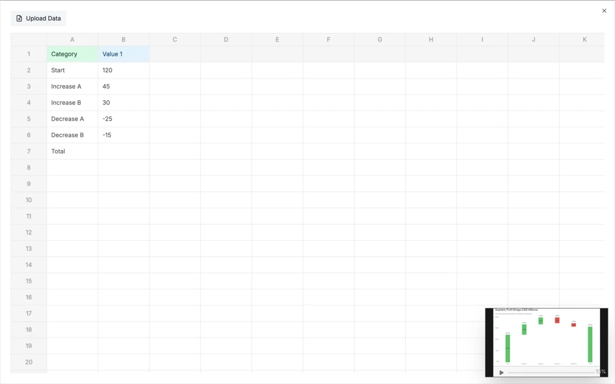
Click Advanced in the top bar and open the Bar section. Waterfall charts follow a standard convention: green for positive bars, red for negative, gray or navy for the sum bar. Set these once and every bar updates. If you're building a branded deck, use your brand's positive and negative palette here.
Format the labels
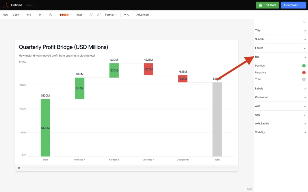
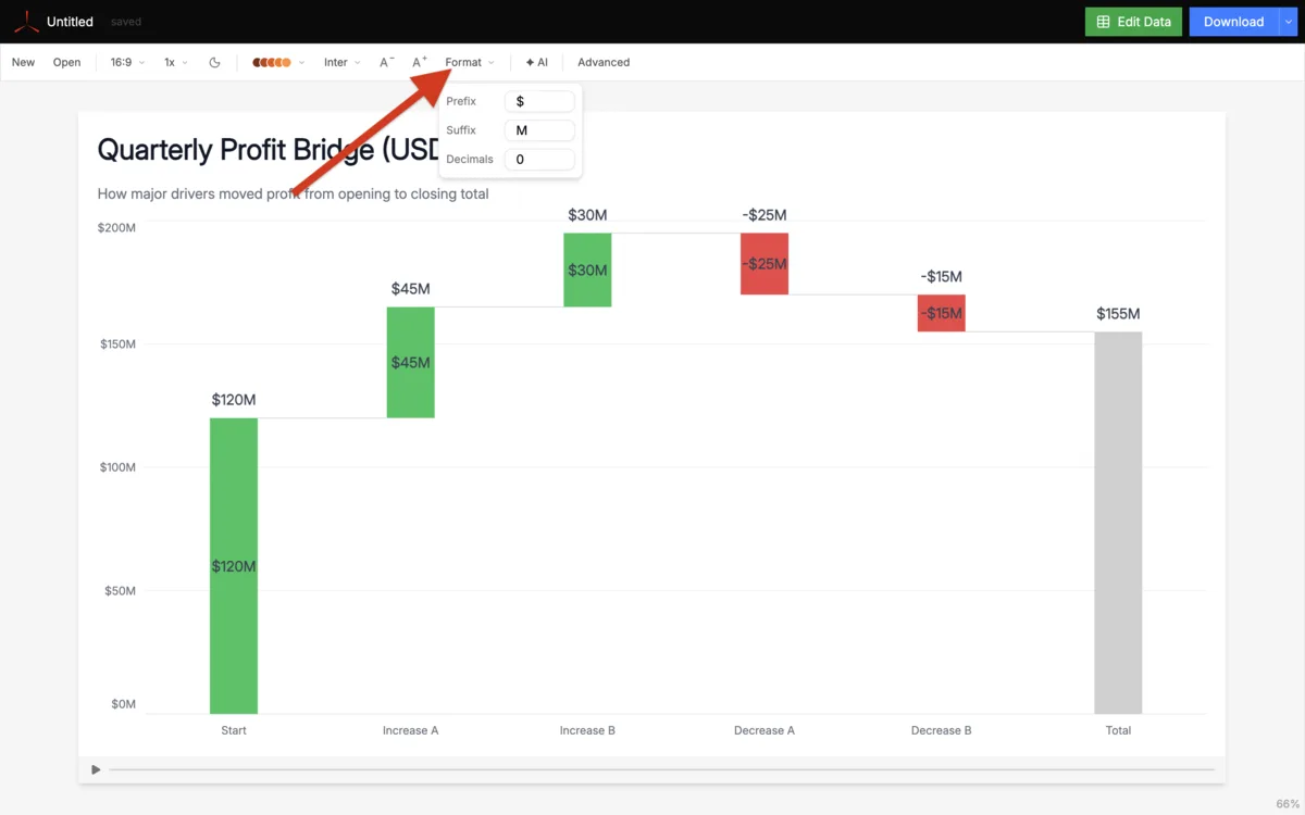
In Format on the top bar, add a currency prefix like $ or a % suffix if your values need it. Under Advanced → Axis Labels, adjust font, size, and color. Well-labeled bars mean readers don't need to check the y-axis — the value is right there on each bar, which matters when the chart is in a slide.
Export
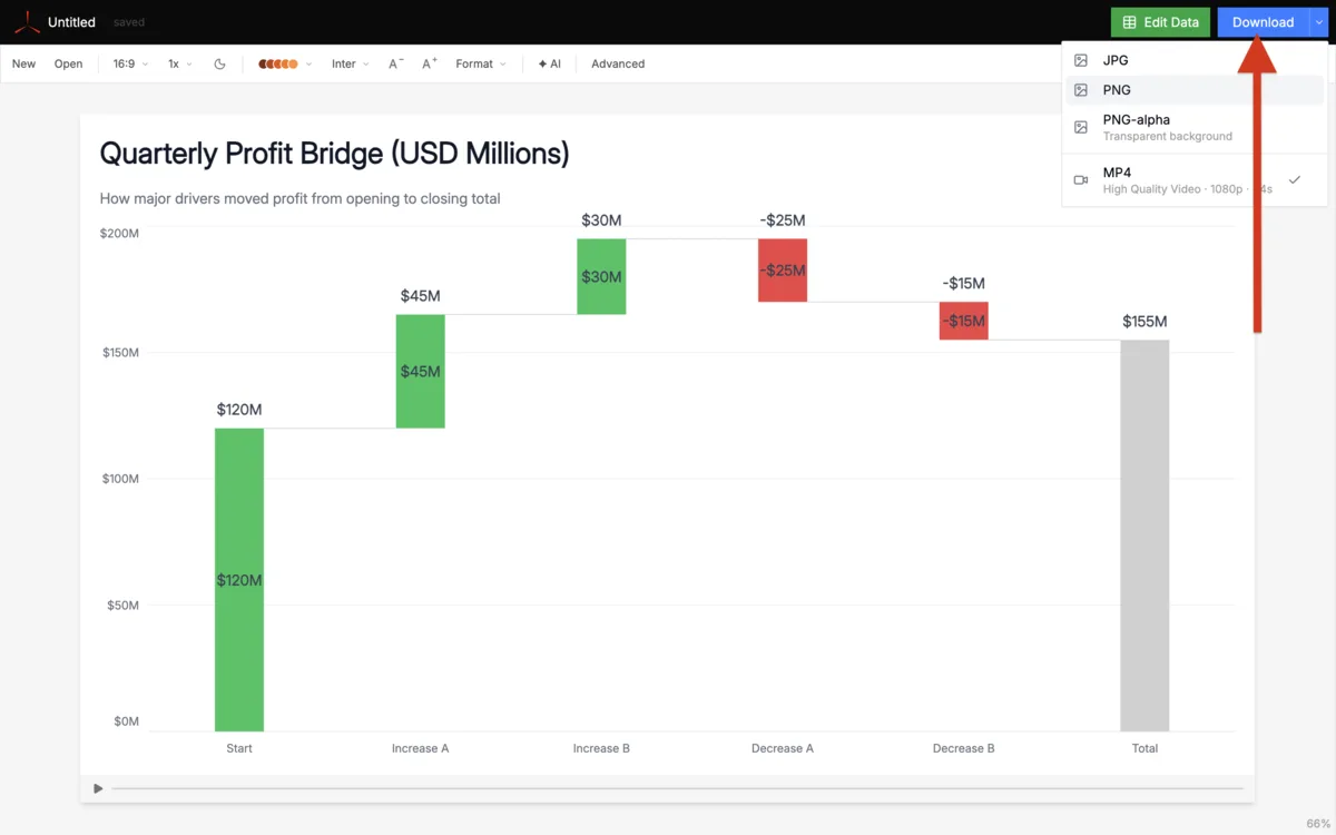
Click Download at the top right to save as a high-res image. Drop it into PowerPoint, Google Slides, or wherever your report lives.
When to use a waterfall chart
P&L bridge
Revenue → COGS → Gross Profit → Operating Expenses → Net Income. Shows exactly what gets taken out at each step, making financial performance immediately readable.
Revenue bridge
How did revenue move from last year to this year? New customers, expansion, price changes, and churn each get their own bar. Standard slide in QBRs and board decks.
Budget variance
Start with the budget, add and subtract each line item that caused the variance, land on actuals. Makes it obvious which categories drove you over or under.
Cash flow
Opening balance → receipts → payments by category → closing balance. Gives a clear picture of how cash moved through the period without needing a full statement.