Animated Charts — Create, Customize & Export as Video
Animated charts turn static data into video — bars that grow, lines that draw themselves, races that unfold in real time. Paste your data, pick a template, and export a professional MP4 in minutes. No coding, no After Effects, no design background needed.
What are animated charts?
An animated chart is a data visualization where the chart elements — bars, lines, pie slices, or numbers — move or reveal themselves over time rather than appearing all at once. The motion transforms raw data into a narrative: a bar growing taller, a line tracing a trend, bars racing past each other as rankings shift.
Animated charts are typically exported as MP4 videos or GIFs, making them easy to share on social media, embed in presentations, or include in newsletters. Unlike interactive web charts that require a browser, a video plays anywhere — Instagram, LinkedIn, PowerPoint, email, TV.
Why animated charts outperform static ones
Motion stops the scroll
The human brain is wired to notice movement. An animated chart in a social feed commands attention before viewers consciously decide to engage — a static image rarely does.
Sequential reveals guide comprehension
When data appears one piece at a time, viewers process each element before the next arrives. Static charts force the reader to do that work themselves — most don't.
You control the narrative
In presentations, animated charts keep the audience focused on what you're saying — values appear only when you want them to. Static charts let the audience read ahead and disengage.
Types of animated charts
Not all animation is equal. Each chart type animates differently and serves a distinct purpose. Here are the five main animated chart types — click any to open a template in the editor.
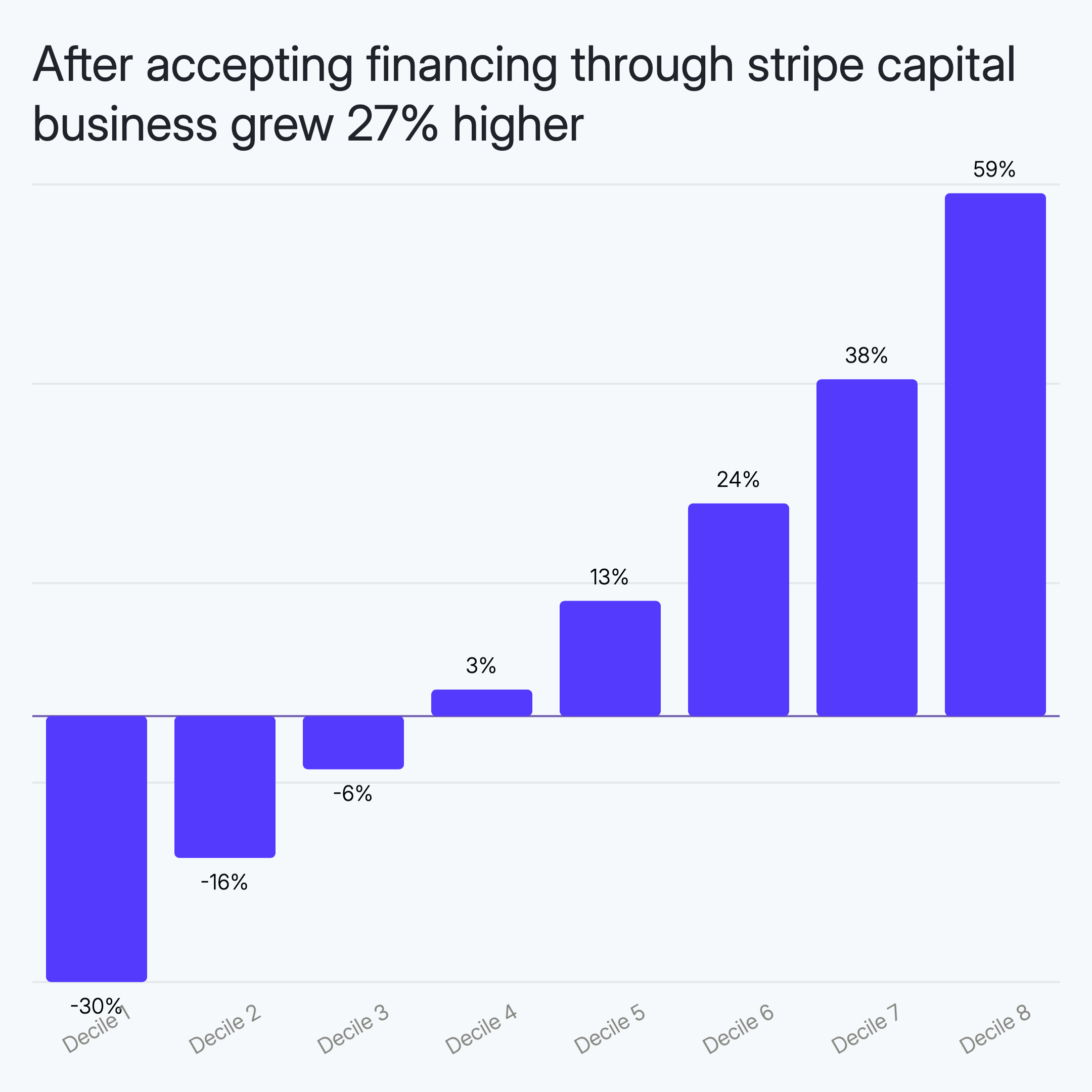
Animated Bar Chart
Bars grow from zero as the animation plays, drawing the viewer's eye to each value in sequence. Whether vertical columns or horizontal bars, the motion transforms a static comparison into a reveal — making the audience feel the data rather than just read it.
Use this when
- Comparing 3–10 categories where the height difference tells the story
- Revealing ranked values one by one for maximum impact
- Showing sales figures, survey results, or performance metrics in presentations
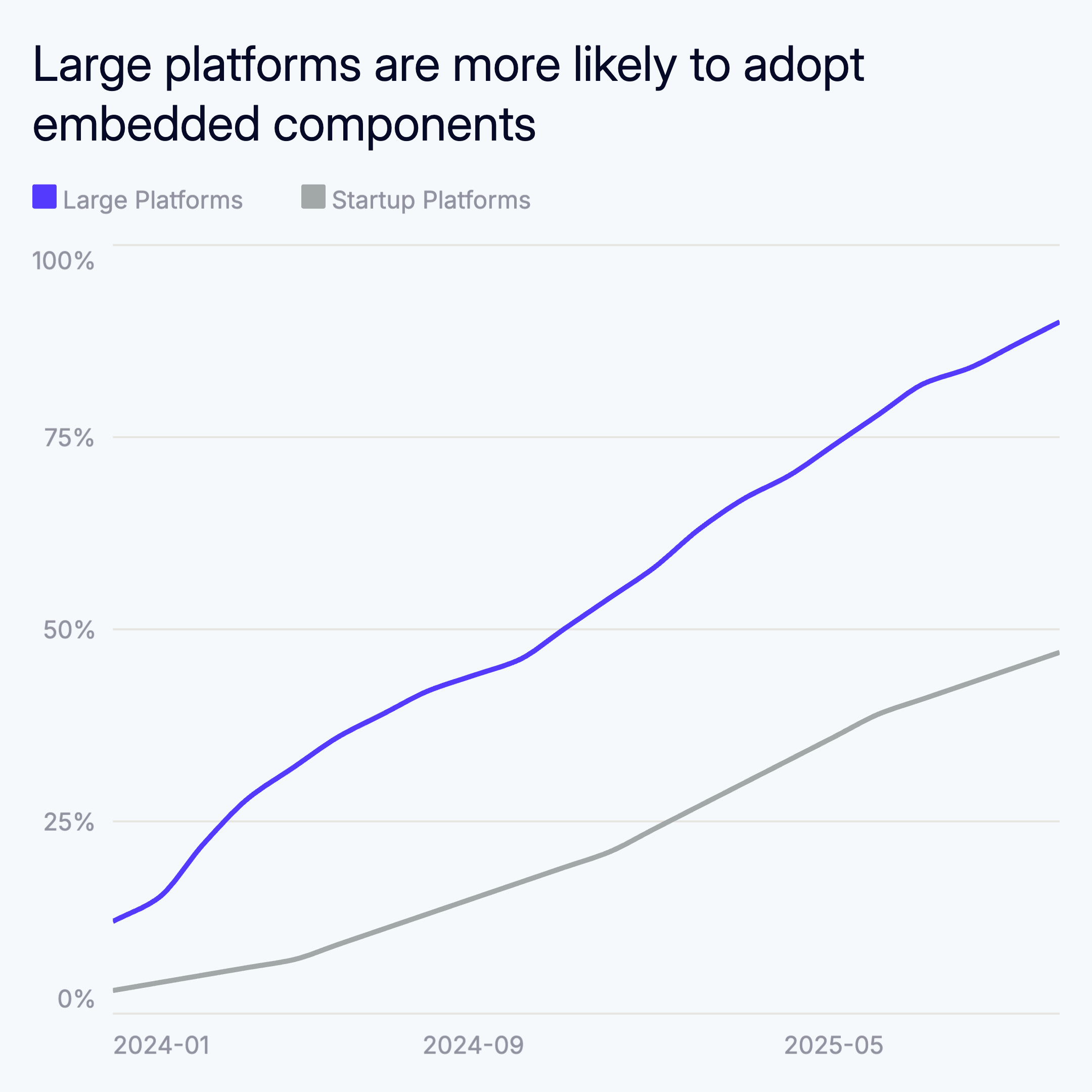
Animated Line Chart
A line that draws itself across the canvas, tracing trends in real time. Animated line charts are ideal for time-series data — revenue growth, user signups, stock prices — where the trajectory matters as much as the endpoint. The self-drawing motion naturally directs attention through the story chronologically.
Use this when
- Showing trends over time: monthly revenue, weekly signups, annual growth
- Comparing multiple series where crossing points and divergence are meaningful
- Creating social media content where a moving line holds attention longer
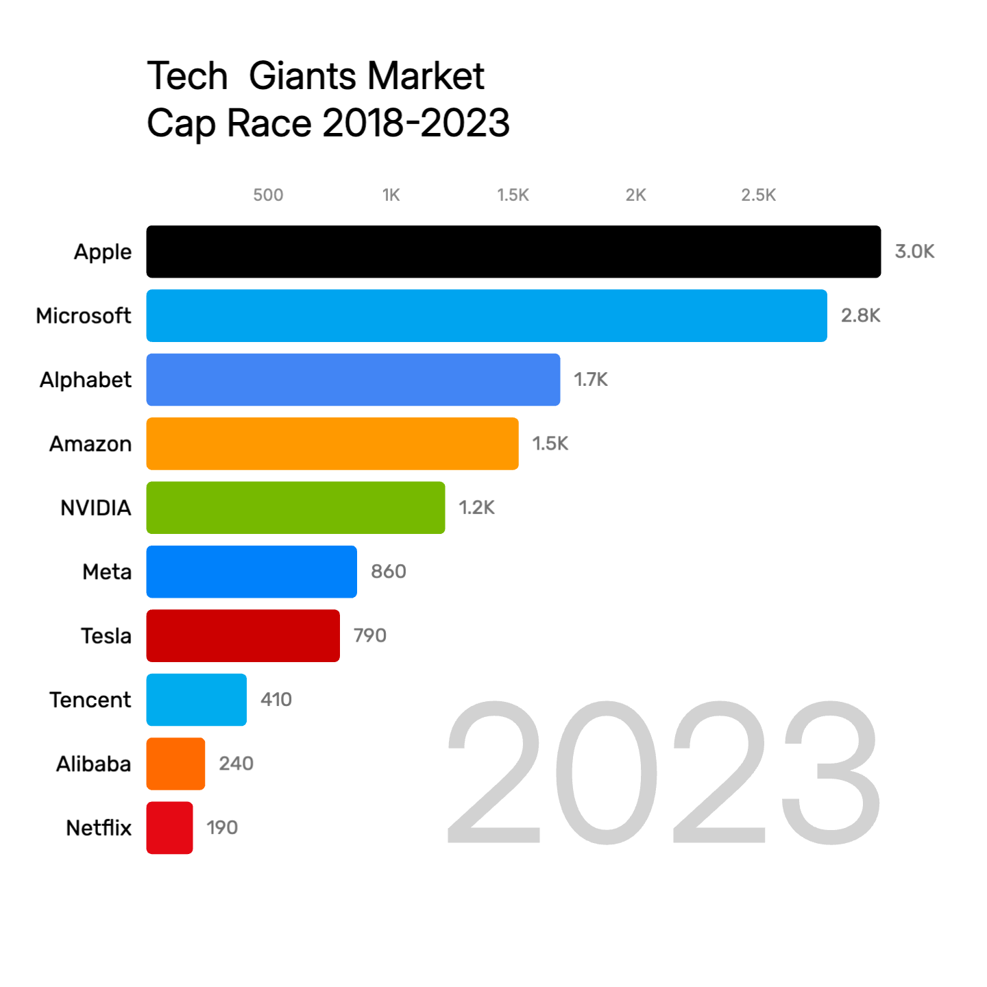
Bar Race Chart
The most viral chart format on the internet. Bars animate left and right, reordering in real time as rankings change across time periods. A bar race chart turns a spreadsheet of historical data into a competition — one that viewers watch to the end to see who wins. Perfect for decade-long datasets, market share battles, or sports stats.
Use this when
- Time-series ranking data where positions shift over years (GDP, market cap, app downloads)
- Social media content — bar race charts consistently drive high engagement and shares
- Investor presentations where you want to show a brand rising through the ranks
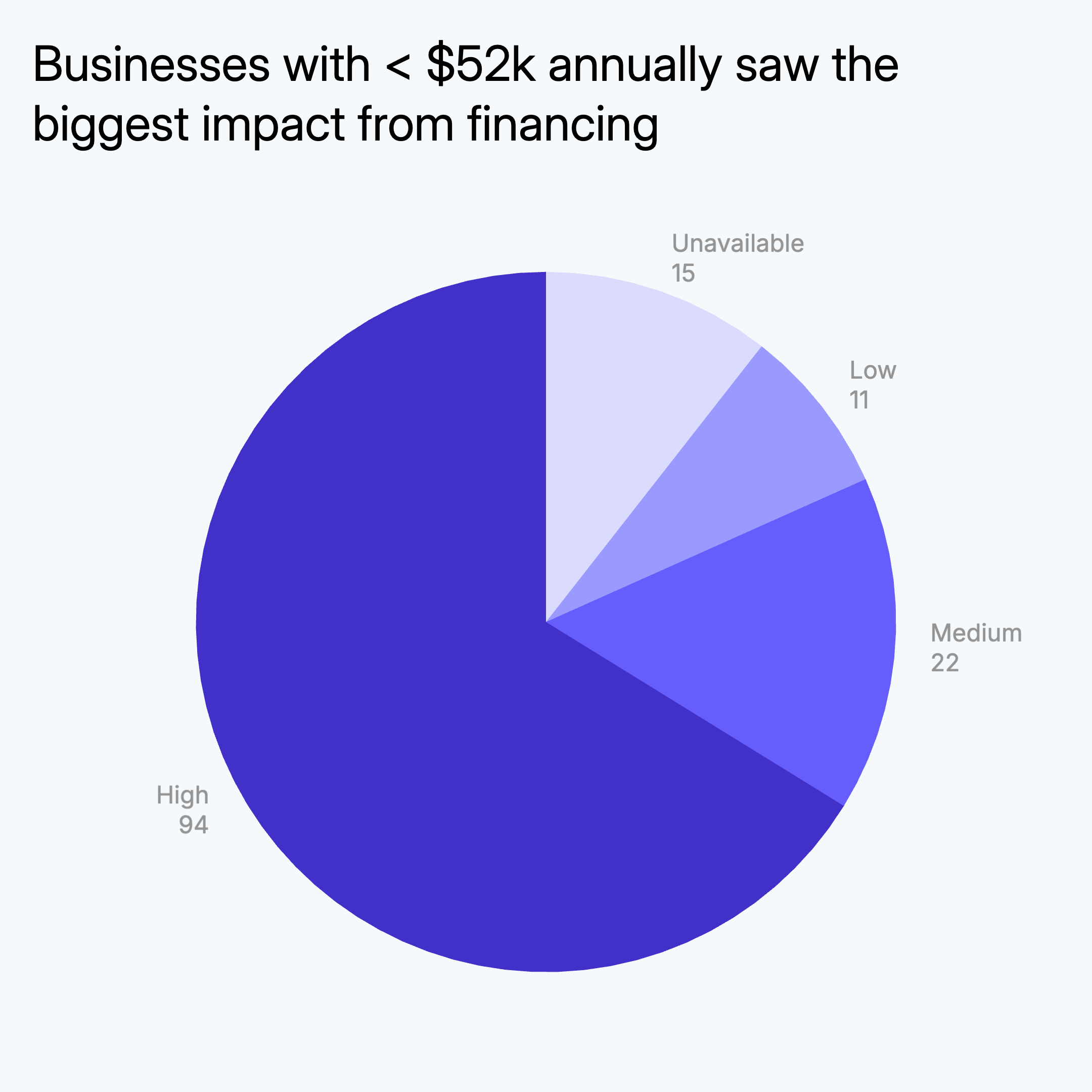
Animated Pie Chart
Slices sweep in from the center, building the full circle segment by segment. Animated pie and donut charts work especially well when emphasizing proportion — one slice growing largest in front of the viewer's eyes has far more persuasive power than a static snapshot. Great for budget breakdowns, market share, and demographic splits.
Use this when
- Part-to-whole data with 3–6 categories where proportions are the story
- Budget, revenue, or market share breakdowns where each slice has a clear label
- Donut chart variants for a modern look in investor decks and reports

Animated Number
A single number that counts up from zero to its final value. Deceptively simple, deeply effective. Animated numbers are the fastest way to make a statistic feel earned — watching $2,400,000 tick upward is inherently more dramatic than reading a static figure. Add a prefix, suffix, or percentage to match your exact use case.
Use this when
- Highlighting a single key metric: total revenue, users reached, deals closed
- Opening slides or social posts where one number needs to land with impact
- Percentage values like conversion rates, growth figures, or satisfaction scores
How to make an animated chart
AECharts is designed to get you from data to exported video in under five minutes. Here's how it works:
- 1
Paste your data
Copy data from Excel, Google Sheets, or any spreadsheet and paste it directly into the editor. AECharts parses it automatically — no CSV upload or formatting required.
- 2
Pick a chart type and template
Choose from animated bar charts, line charts, bar race charts, pie charts, or animated numbers. Select a template that matches your visual style — minimal, editorial, branded, or bold. Customize colors, fonts, titles, and animation speed.
- 3
Export as MP4 video
Hit export and your animated chart renders as a 1080p MP4 in seconds, entirely in your browser. No uploads, no waiting for a server. The file is ready to post on Instagram, LinkedIn, TikTok, or drop into a PowerPoint or Keynote deck.
Animated charts vs. static charts
Animation isn't always the right choice. Here's when animated charts have a clear advantage — and where static still wins.
| Context | Animated | Static |
|---|---|---|
| Attention in feeds | Stops the scroll — motion triggers attention reflex | Easy to skip past without registering |
| Data comprehension | Sequential reveal guides the viewer through the story | Reader must scan and interpret simultaneously |
| Presentations | Each value appears at your pace, building to the conclusion | Audience reads ahead — you lose control of the narrative |
| Social media | High shares, replays, and engagement across all platforms | Functions as a plain image — no replay value |
| Best for | Social posts, investor decks, newsletters, pitch videos | Print, detailed reference documents, dense dashboards |
Ready to make your animated chart?
Browse the full template library — bar charts, line charts, bar races, pie charts, animated numbers, and more.
Browse All Templates