How to Create a Radar Chart in Excel (Spider Chart Guide)
Radar charts (also called spider charts or web charts) are a native Excel chart type in all versions, found under Insert → Surface or Radar Chart. They plot multiple attributes on radial axes, making it easy to compare profiles across categories or entities. The most important setup step is fixing the axis scale — all axes must use the same range or the shape is misleading.
Skip the Excel steps — paste your data and get a clean radar chart in seconds. Export as image or PPTX.
What is a radar chart in Excel?
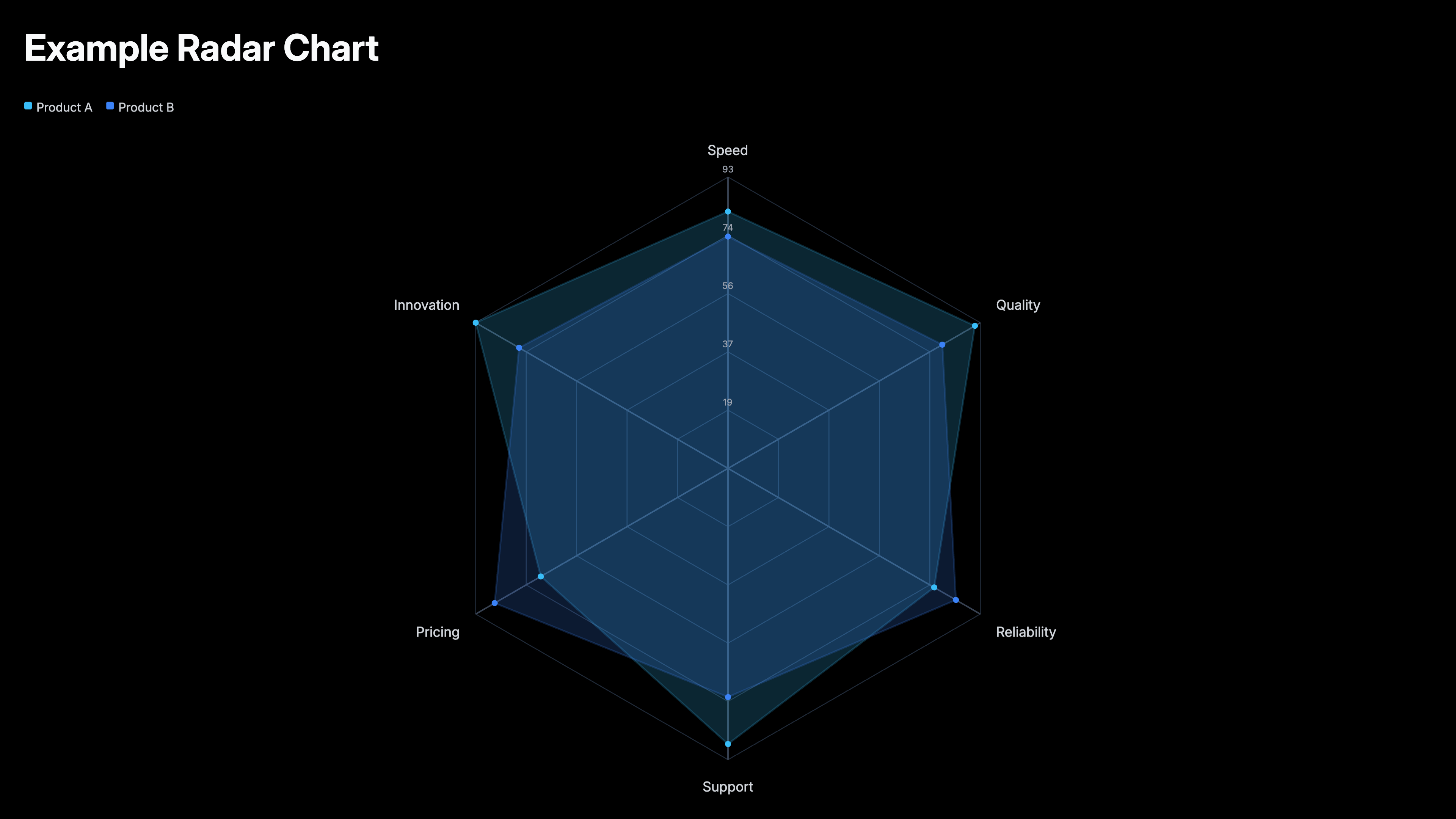
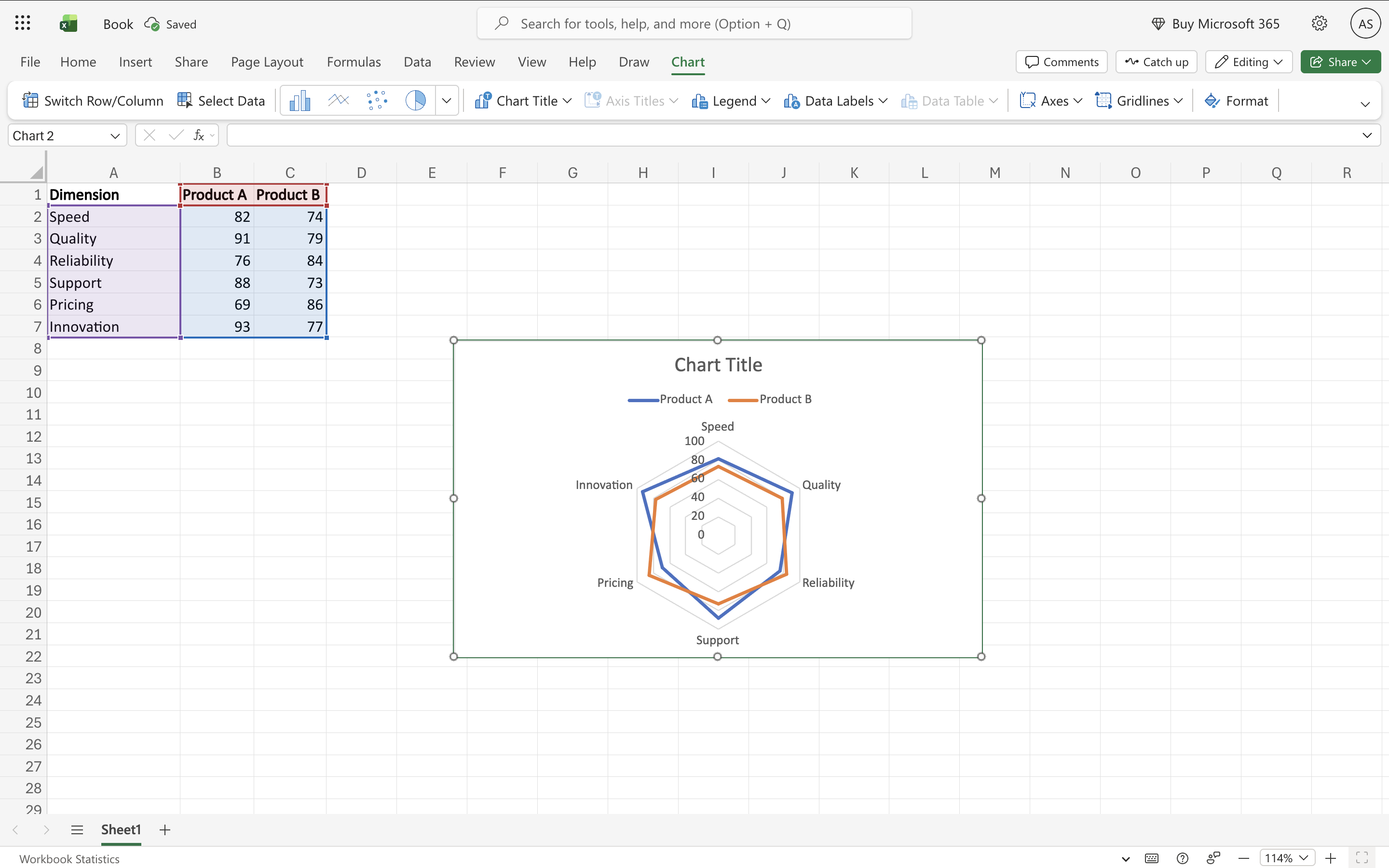
A radar chart in Excel plots values on multiple axes radiating from a center point, connecting the values to form a polygon. Each axis represents one attribute (e.g. speed, cost, quality). Each data series forms its own polygon — comparing two series shows which entity scores higher on which attributes at a glance. Excel offers three variants: Radar (lines only), Radar with Markers (dots at each data point), and Filled Radar (solid or semi-transparent polygons). All are found under Insert → Insert Surface or Radar Chart.
6 steps to make a radar chart in Excel
Prepare your data
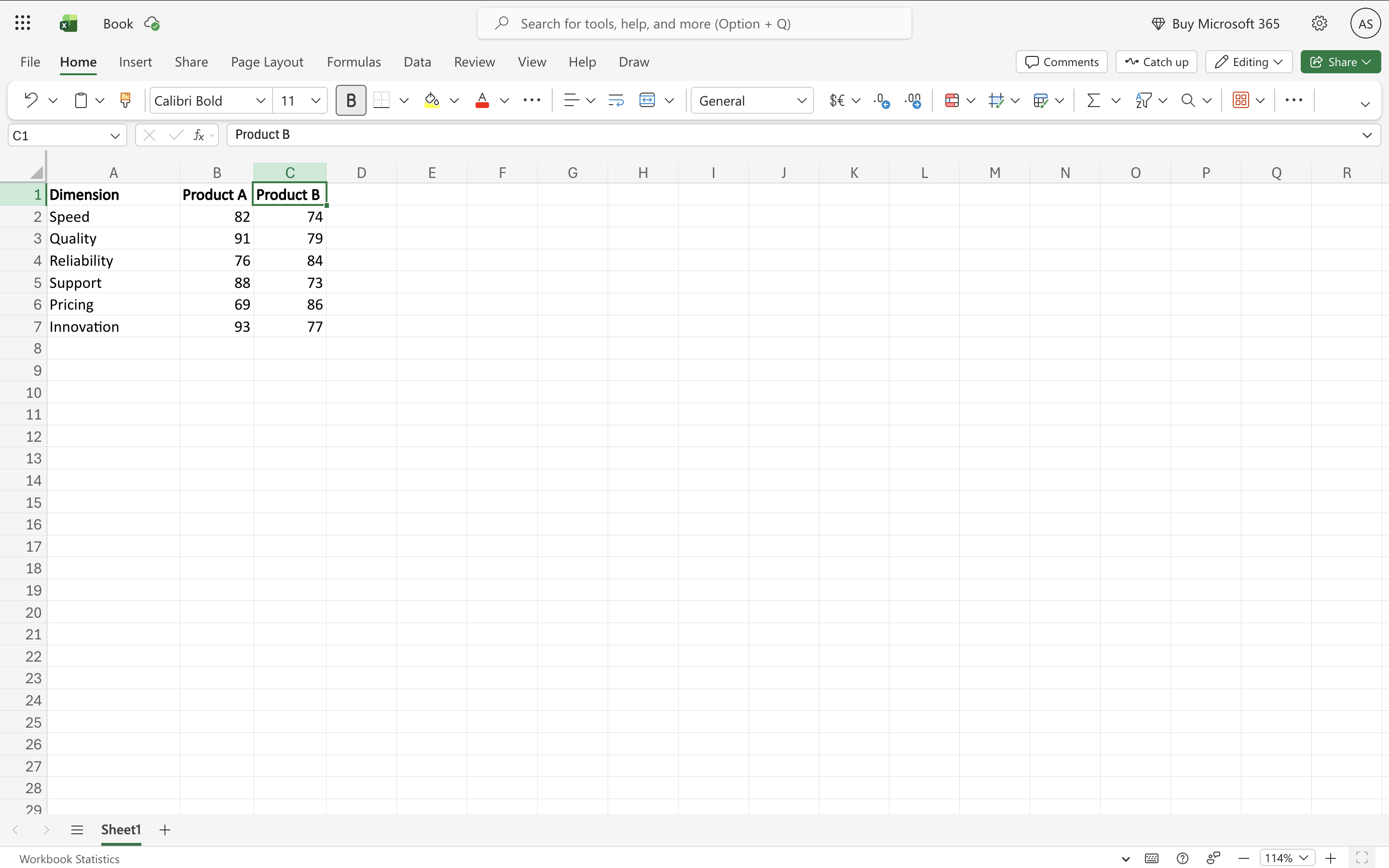
The first column should contain axis labels — these become the spokes of the radar (e.g. Speed, Cost, Quality, Support, Reliability). Each subsequent column is one data series (e.g. Product A, Product B, Competitor). Include headers in the first row. All values should be on the same scale (e.g. all 1–10, or all 0–100) for the comparison to be meaningful.
Select your data range
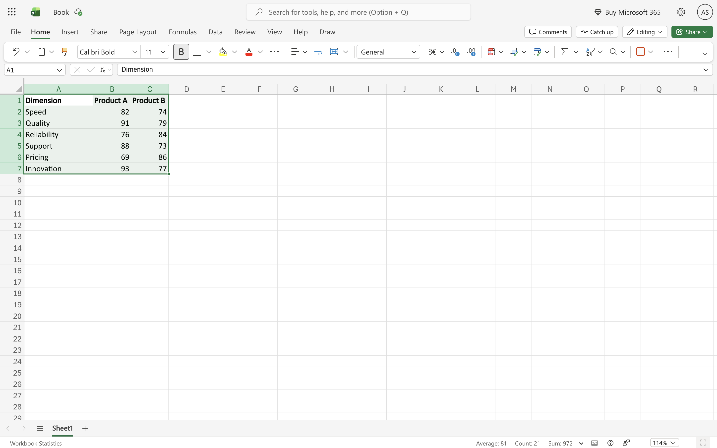
Select all columns including the axis label column and all series columns, with headers. For example, A1:D8 for 7 axes and 3 series.
Insert the radar chart
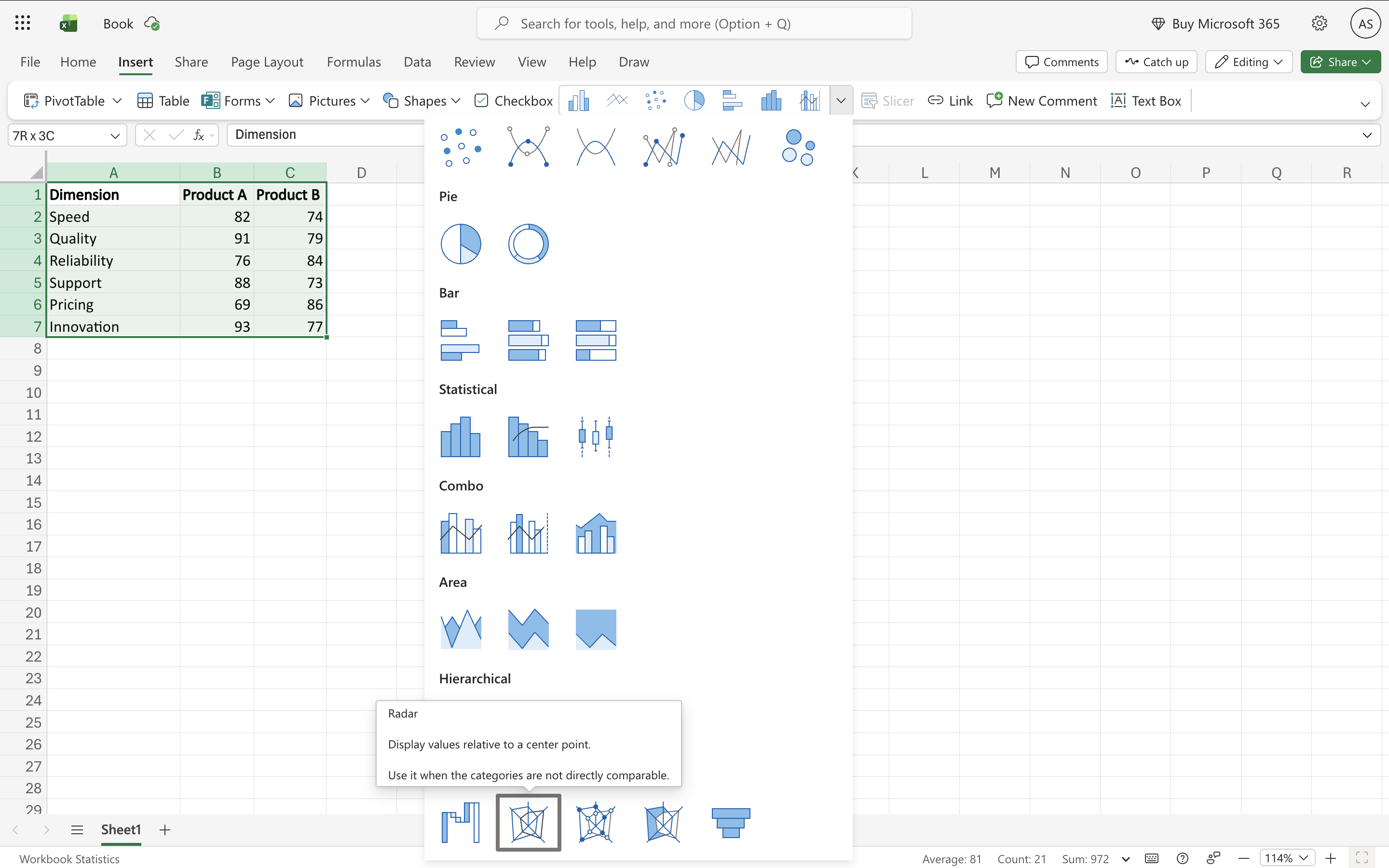
Go to Insert → Charts → Insert Surface or Radar Chart → choose your variant: Radar (clean lines, multiple series visible), Radar with Markers (dots at each data point, useful for reading exact values), or Filled Radar (solid polygons — most visually impactful, but overlapping series need transparency).
Fix the axis scale
This is the most critical step. By default, Excel may set each axis to a different scale, making the polygon shape misleading. Right-click any axis label on the chart → Format Axis → uncheck 'Auto' for both Minimum and Maximum → set Minimum to 0 and Maximum to the same value across all axes (e.g. 10 for a 1–10 scale). This ensures the polygon shape honestly reflects the data.
Format series for readability
For Filled Radar with multiple series: right-click a series → Format Data Series → Fill → Solid Fill → set transparency to 30–50%. This makes both (or all) polygons visible where they overlap. For Radar (lines): increase line width to 2–2.5pt and use clearly distinguishable colors per series.
Add legend and title
Chart Elements (+) → Legend → position below or to the right. Add a descriptive chart title. Data labels are usually not helpful on radar charts — they clutter the spokes. The legend is sufficient to identify series.
When to use a radar chart in Excel
Product or competitor comparison across multiple attributes
Plot two or three products on the same radar. Each spoke is an attribute (price, performance, support, ease of use). The polygon shape immediately shows where each product is strong or weak.
Skills or performance assessments
Employee or team performance across multiple competencies. Each spoke is a skill area; each series is a team member or review period. The polygon shows the overall profile at a glance.
Survey scoring across dimensions
Customer satisfaction, NPS components, or product ratings across multiple dimensions. A spider chart shows which dimensions are lagging vs leading without requiring a reader to scan a table.
Sports statistics comparison
Player or team stats (speed, strength, technique, stamina, tactical) plotted as a radar. Standard in sports analytics dashboards and scouting reports.
Components of a radar chart in Excel
Spokes (axes)
Radial lines from the center, one per attribute. Each spoke has its own scale — all spokes must use the same min/max for fair comparison.
Polygon
The shape formed by connecting each series' values across all spokes. A larger polygon means higher scores across more attributes. The shape communicates the overall profile.
Gridlines
Concentric circles (or polygons in some styles) connecting equally-spaced points on each spoke. Represent the scale divisions — each ring is one step up from the center.
Series
Each data series forms its own polygon. Multiple series are overlaid on the same chart — use different colors and transparency for Filled Radar variants.
Frequently Asked Questions
Related