How to Create a Gauge Chart in Excel (Donut Workaround)
Excel has no native gauge chart or speedometer chart type. The standard workaround uses a Donut chart with three carefully structured data points — your value, its remainder, and an invisible buffer that creates the semicircle effect. This guide covers the exact data setup, rotation, and formatting steps to build a functional gauge that updates automatically when your source data changes.
Skip the Excel steps — paste your data and get a clean gauge chart in seconds. Export as image or PPTX.
What is a gauge chart in Excel?
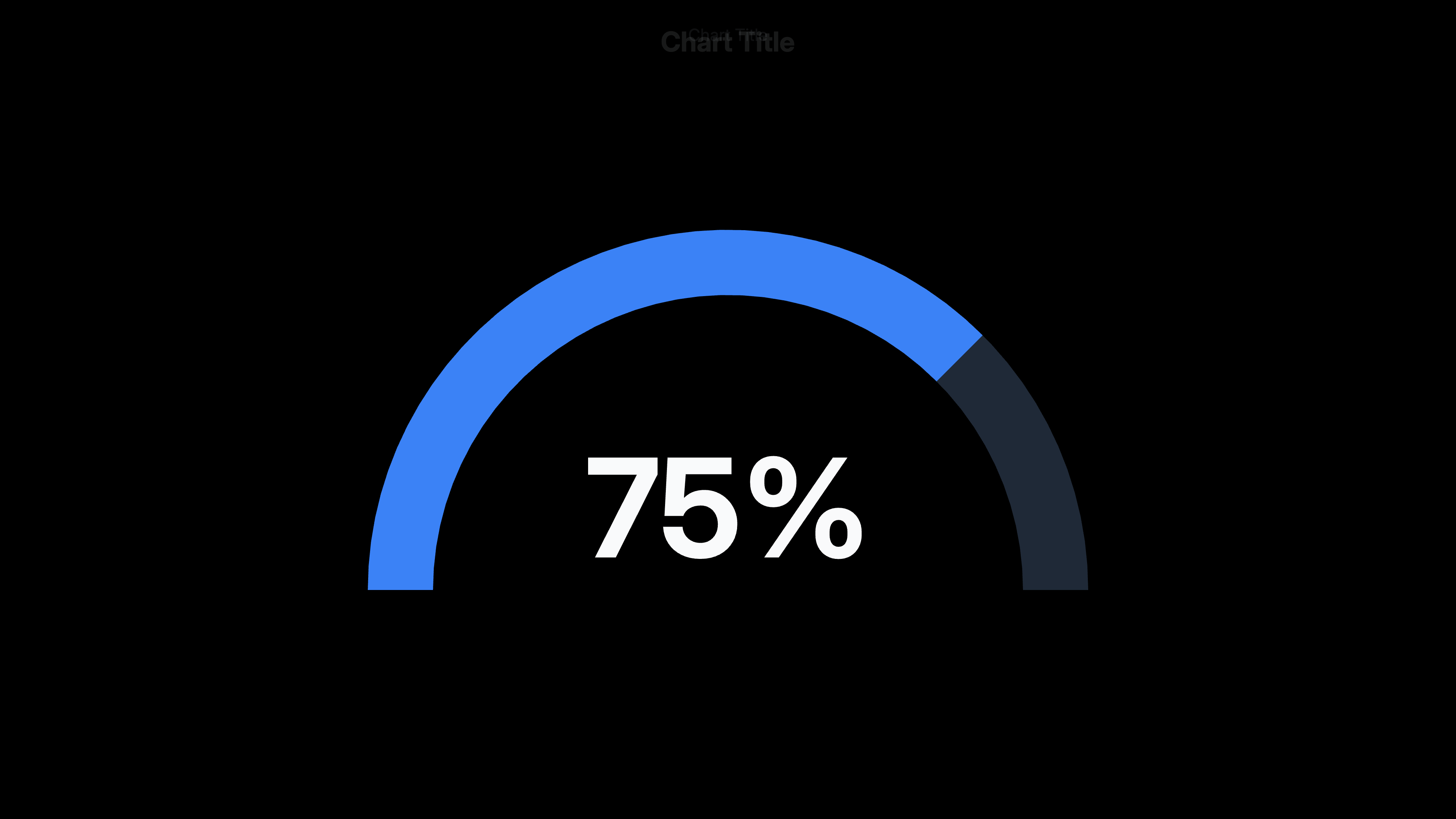
A gauge chart (also called a speedometer chart or dial chart) displays a single metric on a curved scale, like a car speedometer. Excel doesn't offer this as a native chart type — the workaround builds it from a Donut chart. The donut is divided into three slices: the visible gauge value, a gray remainder, and a hidden 100-unit buffer that occupies the bottom half of the circle. After rotating and hiding the buffer, you're left with a semicircle that reads as a gauge. A text box in the center displays the numeric value.
6 steps to make a gauge chart in Excel
Set up the helper data table
In a column, enter three values: (1) your gauge reading — e.g. 65 for 65%, (2) the remainder — 100 minus your value, e.g. 35, (3) the buffer — always 100. Total of all three = 200. In an adjacent column, add labels: Gauge, Remainder, Buffer. The buffer value is fixed at 100 regardless of your metric — it represents the hidden bottom half of the circle.
Insert a Donut chart
Select the value column only (not the labels), go to Insert → Charts → Insert Pie or Donut Chart → Donut. Excel creates a full circle with three slices. It will look wrong at this stage — that's expected.
Rotate the first slice to 270°
Right-click the donut → Format Data Series → Angle of first slice → set to 270°. This rotates the chart so the Buffer slice (100 units) sits at the bottom, and the Gauge and Remainder slices occupy the top semicircle. The Buffer now spans exactly the bottom half because 100 out of 200 total = 50% = 180°.
Hide the Buffer slice
Click the Buffer slice (the large bottom half — it should now be at the bottom after rotation). You may need to click once to select the series, then click again to select just the Buffer slice. Format Data Point → Fill: No Fill → Border: No Border. The Buffer disappears, leaving only the top semicircle visible.
Color the gauge and remainder slices
Click the Gauge slice (your metric value) → Format Data Point → Fill: set your accent color (blue, green, etc.). Click the Remainder slice → Fill: light gray (#E5E5E5 or similar). Remove any border outlines for a clean look. The semicircle now visually reads as a gauge.
Add a center value label
Go to Insert → Text Box → draw a text box over the center hole of the donut. To display a live value that updates: type = in the text box formula bar, then click the cell containing your gauge value. Set a large, bold font (24–32pt) and center it. Add a smaller label below it (e.g. '% Complete') as a second text box.
When to use a gauge chart in Excel
KPI dashboards
Show a single metric against a target — completion rate, customer satisfaction score, budget utilization — in a format executives immediately recognize from physical gauges.
Progress toward a goal
Display how far along a project, fundraiser, or sales target is. The filled arc makes progress intuitively obvious without requiring the viewer to read a number.
Performance scorecards
One gauge per key metric on a dashboard page. Multiple gauges give a quick health check across dimensions: revenue, NPS, retention, margin.
Survey result visualization
Satisfaction scores, NPS, or likert averages displayed on a 0–10 or 0–100 gauge. Easier for non-data audiences to read than a bar at 7.3/10.
Components of a gauge chart in Excel
Gauge slice
The filled arc representing your metric value. Covers an angle proportional to the value out of 100. Set to your brand or metric color.
Remainder slice
The unfilled portion of the semicircle. Represents 100 minus your value. Set to light gray to distinguish it from the gauge.
Buffer slice
A hidden 100-unit slice that occupies the bottom half of the donut circle. Made invisible (no fill, no border) after rotating to the bottom. Its only purpose is to create the semicircle shape.
Center text box
A text box placed over the center hole of the donut displaying the numeric value. Linked to the source data cell so it updates automatically.
Adding Color Zones to an Excel Gauge Chart
A gauge with red/yellow/green zones (like a traffic light) requires splitting the visible semicircle into multiple slices instead of two. Replace the single Remainder slice with three zone slices — red (0–33), yellow (33–67), green (67–100) — each with its threshold value. Add a thin "needle" series on top as a separate pie chart overlaid on the donut.
This multi-layer approach requires two separate charts stacked on top of each other: the zone donut underneath and a needle pie chart above. It works but involves significant manual positioning. For a cleaner result with color zones and animation, a dedicated gauge chart tool handles this automatically.
Frequently Asked Questions
Related