How to Create The Economist Style Charts
A Design System Breakdown
The Economist's data visualizations are among the most recognizable in journalism. Their charts appear in boardroom presentations, research papers, and across social media, not despite their minimalism, but because of it. While many chase visual complexity, The Economist proves that restraint, consistency, and clarity create the most shareable and trustworthy charts. Whether you're a data analyst, journalist, or business professional, understanding their design system will elevate your own visualizations from forgettable to iconic.
What Makes The Economist Charts Instantly Recognizable
You can recognize a chart is from The Economist without seeing a logo watermark, thanks to their iconic minimalist red color palette and disciplined design system.
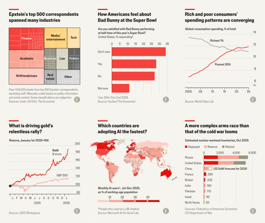
Their repertoire ranges from standard line and bar charts (both horizontal and vertical) to more sophisticated forms like dumbbell charts, slope charts, and heatmaps. They choose the simplest chart type that serves the story. The tone is minimal with one clear takeaway with every element serving the message.
Color System

The Economist's color system is ruthlessly simple. Their primary palette includes:
- Economist Red:
#E3120B— reserved for primary data - Black:
#0D0D0D— titles, axis lines, labels - Off-white:
#F5F4F0— background
Black and grays handle all text (titles, ticks, labels, and annotations). Red is reserved for the plot elements themselves. The plot background is typically off white, creating a warm, paper-like quality that distinguishes it from the stark white of generic charts.
While The Economist experimented with various background treatments over the years, their current digital charts consistently use the signature off white.
Within the plot, the primary data point—the one driving the narrative—gets the full Economist red. Supporting data receives lighter reds (#FF6B6B, #FF9999) or grays (#999999, #BBBBBB). They never introduce additional hues unless absolutely necessary for categorical distinction.
Typography & Hierarchy

The title is the star of every Economist chart. It's a headline written in plain language that anyone can understand. It states the insight directly: "Sales jumped 40% in Q4" instead of "Q4 Sales Data." They use a bold sans-serif font (proprietary Econ Sans, but similar to Arial Bold or Helvetica Bold).
Font Specifications:
- Title: Bold, typically 18-22px, black
- Subtitle: Semi-bold, 9-11px, black or gray
- Labels: Semi-bold, 9-11px, black or white (context-dependent)
- Tick labels: Thin, 9-11px, dark gray
- Annotations: Regular, 9-11px, matches the element it's labeling
The title font size is typically 2× the subtitle size. If the subtitle is 10px, the title is 20px. This creates instant visual hierarchy. Importantly, ticks, labels, and subtitles all share the same font size, creating consistency across supporting elements.
Annotations are direct and minimal. They label points inline rather than relying on legends. Numbers appear directly on or near bars and lines.
Data Emphasis Strategy
The Economist follows one golden rule: one chart, one message. The primary data point that carries the insight receives full red. Everything else is supporting cast. If the message is "UK leads in growth," the UK bar blazes red while other countries fade to gray. This isn't decoration but visual storytelling.
The subtitle serves as the "academic title", it describes what the data actually shows. For example, if the title is "China's economy is slowing," the subtitle might be "GDP growth, % change year-on-year." Set in a subtle gray at half the title size, it's present but never competes for attention.
Supporting data, context, and comparisons are rendered in light grays or desaturated reds. Historical baselines, peer comparisons, or "for reference" series appear at 30-50% opacity. They're present for context but never compete with the hero data.
Key Takeaways
- Limit Your Palette to Red, Black, Gray, and Beige
- Your Title is Your Headline, Not a Label
- One Chart, One Message
- Direct Labeling > Legends
- Show Only Essential Grid and Axis Lines
- Embrace White Space
Try It Yourself
Start with an Economist bar chart template or Economist line chart template and see how quickly you can transform your data into publication-quality visualizations. The design system does the heavy lifting—you focus on the story.